
In my first post where I used SwiftUI to emulate user interface (UI) elements from the NYT Games app, I showed how to create the custom title bar that is prominent on the main screen. This is mostly a straightforward process, though requiring creating content for an icon and a custom font, which we place in the toolbar with a prominent placement. The simplest approach in SwiftUI for the title bar is typically to wrap the name of your screen (or app) in a navigation title modifier, however, this modified approach allows us to place key product branding in a highly visible position.
This post is the second part of a series, to view the first post where I constructed the header, click here. If you want to view the code on my GitHub repository, click here.

Today we will be building the tiles that are featured throughout the main screen of the app, which you tap on to open each respective game. These are large and clear UI components that clearly communicate to the user their purpose, alongside key branding such as the font, color scheme, and iconography.
Lets get started.
Create the File and Placeholders
First we will create a new swift file, where we will build our game tile view using SwiftUI. In XCode, expand the File menu, then select “File From Template,” and “SwiftUI View” in the subsequent menu. Give this file the name GameTileView.swift and save it; this is where we will do most of our UI building today.
Reviewing the reference image from the real NYT Games app above, we can see six key interface elements, which we will imitate:
- Title Text in the upper left, using the custom Cheltenham font
- Caption Text underneath the title, in smaller secondary text
- Date as formatted Text on the lower left, in a bolded sans font
- Author name Text as in the lower right, as capitalized secondary text
- Background Color
- Icon View on the right
To begin implementing these in our new view, we will first add placeholders at the top of our new view structure, as well as defining a generic type for the GameIcon which will also conform to view. These placeholders must also be included in the preview.
struct GameTileView<GameIcon: View>: View {
let title: String
let caption: String
let date: Date
let author: String
let background: Color
let icon: () -> GameIcon
var body: some View {
Text("Hello, World!") // Will replace with our code
}
}
#Preview {
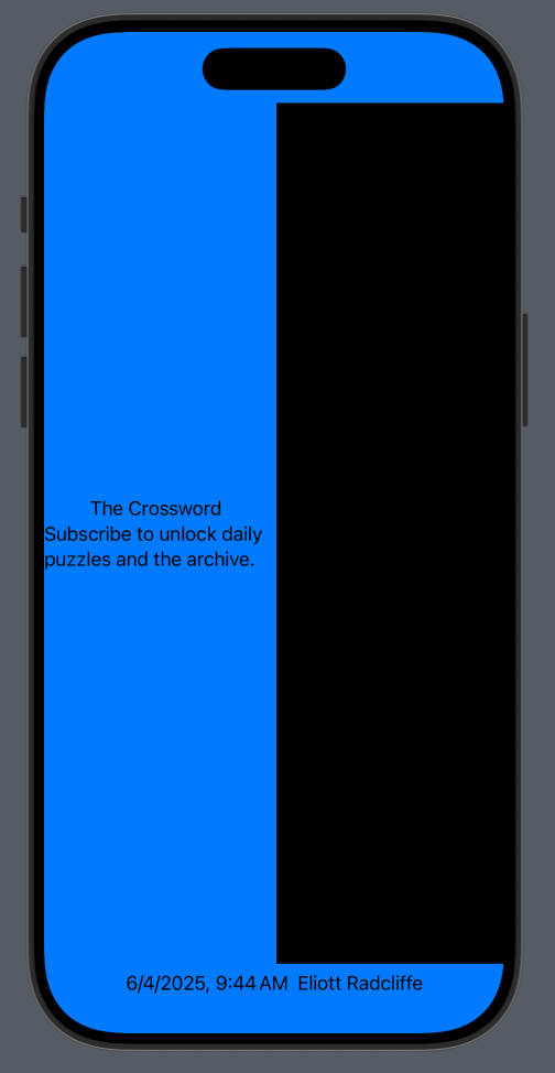
GameTileView(
title: "The Crossword",
caption: "Subscribe to unlock daily puzzles and the archive.",
date: .now,
author: "Eliott Radcliffe",
background: .blue,
icon: { Color.black }
)
}We can begin building the basic layout of our view where we currently have the placeholder “Hello World!” Text. Replace that with a vertical stack, which itself contains a pair of horizontal stacks. In the first of the horizontal stacks (or “rows”) we can place another vertical stack containing the title and caption text with our game, and then the icon view which will be placed on the right. In the second row, we place text for the date and author name, using the .formatted() method on the former to convert to string. Finally, we attach a .background modifier to apply the color to the content of the tile.
VStack {
    HStack {
        VStack {
            Text(title)
            Text(caption)
        }
        icon()
    }
    HStack {
        Text(date.formatted())
        Text(author)
    }
}
.background(background)
At this point, the view bears little resemblance to the actual tiles in NYT Games, however, we can see it contains the basic layout elements: The title and caption are on the left, with a big black rectangle on the right that will eventually hold the game icon, with date and author text on the bottom. Nothing is formatted just yet, and the proportions are completely wrong, but the scaffold of the tile view is all there.
Add Frames, Padding, and Rounded Corners
The largest step towards making our basic layout resemble the actual game tile is to apply constraints to its geometry, making its size and shape actually match that of the tile in the real app. Start by adding a set of constants inside of the view structure (I usually place these at the bottom, but you can choose according to your preference). These define dimensions for padding, overall height of a tile, height of its icon, and the corner radii. Note that these are placeholders for the time being, and can be edited later to better match the real thing.
// MARK: - Constants

private let paddingWidth: CGFloat = 24
private let tileHeight: CGFloat = 164
private let tileCornerRadius: CGFloat = 16
private let iconSize: CGFloat = 72
private let iconCornerRadius: CGFloat = 8
Now, below the main vertical stack, we can apply these constants using a series of view modifiers; padding to surround the entire tile view, a frame constraining the tile height, and a rounded rectangle for the background. Note that the commented “other view components” does not exist in the real code, I have used that to focus strictly on the modifications.
VStack {
    /* other view components */
}
.padding(paddingWidth)
.frame(maxWidth: .infinity, maxHeight: tileHeight)
.background {
    RoundedRectangle(cornerRadius: tileCornerRadius).fill(background)
}
Next, on our icon (the one provided as an argument), attach frame, clip, and padding modifiers to constrain its shape to be similar to that in the NYT Games app, using the constants we defined before.
icon()
    .frame(width: iconSize, height: iconSize)
    .clipShape(.rect(cornerRadius: iconCornerRadius))
    .padding(.leading, paddingWidth)
With these changes, we can see the view starting to resemble the form of the game tile. We still need to stylize the content of the tile (the text looks fairly plain, and the icon is missing), but you can see it starting to take form.

Fonts and Formatting
Now we will add some stylization to the tile, primarily in the form of custom fonts, as well as working to get text layout and wrapping to look as we intend. Start with the title and caption, which are included in the first row of the vertical stack in our view body, which now will include a leading alignment in its constructor. Apply a font modifier to each of these Text views, in the case of the title using our custom Cheltenham font, and in the case of the caption using a standard subheadline font. Also, for the caption we will use a secondary foreground color, which is semitransparent and will adapt to the background. The fixed size modifier attached to the entire stack will help to better manage wrapping, so that our caption wraps to a second line rather than truncating.
VStack(alignment: .leading) {
    Text(title)
        .font(.custom("CheltenhamStd-Bold", size: 22, relativeTo: .title2))
    Text(caption)
        .font(.subheadline)
        .foregroundColor(.secondary)
}
.fixedSize(horizontal: false, vertical: true)
Next we will update the date and author strings on the bottom row of the main vertical stack. First we modify the .formatted modifier on this date; where before we used a default date format, now we provide arguments that will make it consistent with the “Sunday, June 1” date format we see in the reference image. We want to push the date and author views to the left and right edges of the view, respectively, which we can achieve by placing a Spacer() in between. We want to put the word “By” in front of the author name, and then make the latter uppercase. We do this by making two Text views for the author name, adding them together, and putting them inside of a parentheses. The parentheses allows us to add a common modifier to both, in this case setting a footnote font, and using the secondary foreground color. Once again, the fixedSize modifier is used to better manage text wrapping.
HStack {
    Text(date.formatted(.dateTime.weekday(.wide).month(.abbreviated).day()))
        .font(.headline)
    Spacer()
    ( Text("By ") + Text(author.uppercased()) )
        .font(.footnote)
        .foregroundColor(.secondary)
}
.fixedSize(horizontal: false, vertical: true)
Now, we can see that an individual tile much more closely resembles that of the NYT Games tile, except for the icon which we have not yet created.

Adding to the GamesPage
In the last post, we created the GamesPage view just as a backdrop on which to place our header, now we will build a set of tiles to display as its body content. We haven’t yet fleshed out the content, including icons and linked game views, for each of these, but we can construct a series of game tiles as an extension to our GameTileView that follow a syntax similar to the preview we constructed earlier. I won’t cover each in detail, but I will mention that we need to specify the generic type as <Color> to avoid a compiler error.
extension GameTileView {

    // MARK: - Presets

    static var crossword: some View {
        GameTileView<Color>(
            title: "The Crossword",
            caption: "Subscribe to unlock daily puzzles and the archive.",
            date: .now,
            author: "Eliott Radcliffe",
            background: .blue,
            icon: { Color.black }
        )
    }

    static var spellingBee: some View {
        GameTileView<Color>(
            title: "Spelling Bee",
            caption: "Make as many words as you can with 7 letters.",
            date: .now,
            author: "Eliott Radcliffe",
            background: .yellow,
            icon: { Color.orange }
        )
    }

    static var wordle: some View {
        GameTileView<Color>(
            title: "Wordle",
            caption: "Guess your way to the correct word.",
            date: .now,
            author: "Eliott Radcliffe",
            background: .gray,
            icon: { Color.green }
        )
    }

    static var connections: some View {
        GameTileView<Color>(
            title: "Connections",
            caption: "Group words that share a common thread.",
            date: .now,
            author: "Eliott Radcliffe",
            background: .purple,
            icon: { Color.pink }
        )
    }

    static var theMini: some View {
        GameTileView<Color>(
            title: "The Mini",
            caption: "Solve the puzzle in seconds.",
            date: .now,
            author: "Eliott Radcliffe",
            background: .teal,
            icon: { Color.blue }
        )
    }
}
We can now add each of these to the vertical stack in the GamesPage body, with a spacing setting applied to resemble the NYT Games implementation.
VStack(spacing: 36) {
    GameTileView<Color>.crossword
    GameTileView<Color>.spellingBee
    GameTileView<Color>.wordle
    GameTileView<Color>.connections
    GameTileView<Color>.theMini
}
.padding()
Now, with the basic template representation of each of the game tiles, if we compile the app again or view a preview, we’ll see a stackup with the header we created in the previous exercise, and a scrolling column with the five basic game tiles.

Summary
In this exercise, we covered creating the layout of a games tile imitating the style of those in the NYT Games app. An arrangement of vertical and horizontal stacks was used to place the tile content, including title and caption test, a placeholder for icon content, date, and author name. Frame constraints, padding, spacing, rounded corners, and background colors were used to refine the form of the tile.
As we conclude, clearly the style does not yet match that of the actual app; we still need to create some of the key branding attributes such as the color scheme and game icon designs. Those will be the subject of part 3 of this series, soon to follow, so stay tuned!
This post is the second part of a series, to view the first post where I constructed the header, click here.